| 일 | 월 | 화 | 수 | 목 | 금 | 토 |
|---|---|---|---|---|---|---|
| 1 | 2 | 3 | 4 | 5 | 6 | 7 |
| 8 | 9 | 10 | 11 | 12 | 13 | 14 |
| 15 | 16 | 17 | 18 | 19 | 20 | 21 |
| 22 | 23 | 24 | 25 | 26 | 27 | 28 |
| 29 | 30 | 31 |
- SSR
- bitcoin
- solidity
- concept
- CLASS
- 삶
- hardhat
- 기준
- express.js
- tailwindcss
- Redux
- REACT
- graphQL
- typeScript
- API
- useState
- Interface
- Props
- web
- nextJS
- JavaScript
- evm
- blockchain
- middleware
- CSS
- built in object
- HTML
- Ethereum
- error
- node.js
- Today
- Total
ReasonJun
CSS : media 본문
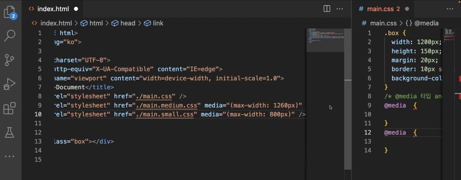
In CSS, media queries allow you to apply different styles based on specific characteristics of the device or viewport where the webpage is being displayed. Media queries provide a way to create responsive designs that adapt to different screen sizes, resolutions, and other device capabilities.
Media queries are introduced using the @media rule and can be used to specify different CSS rules and properties based on various conditions. The most common condition in media queries is the viewport width, but you can also target other aspects such as the device orientation, resolution, or specific media features.
Here's an example of a media query that adjusts the font size based on the viewport width:
@media (max-width: 600px) {
  body {
    font-size: 14px;
  }
}
In this example, the @media rule is used to target viewports with a maximum width of 600 pixels. When the viewport width is 600 pixels or less, the font-size property of the body element is set to 14px.
Media queries can also be used to target different types of devices or specific media features. For instance, you can adjust styles for print media, targeting specific screen resolutions, or even apply styles based on the device's orientation (portrait or landscape).
Here's an example of a media query targeting print media:
@media print {
  body {
    background-color: white;
    color: black;
  }
}
In this example, when the webpage is being printed, the background color of the body element is set to white and the text color to black.
Media queries provide a powerful tool for creating responsive designs and optimizing the appearance of web pages across different devices and media types. They enable you to tailor the styling and layout of your content to provide the best user experience on various screens and devices.
https://developer.mozilla.org/en-US/docs/Web/CSS/@media
@media - CSS: Cascading Style Sheets | MDN
The @media CSS at-rule can be used to apply part of a style sheet based on the result of one or more media queries. With it, you specify a media query and a block of CSS to apply to the document if and only if the media query matches the device on which th
developer.mozilla.org
Categorize and save css files

'Frontend > CSS' 카테고리의 다른 글
| Webkit in css (0) | 2023.06.14 |
|---|---|
| CSS : min-content, object-fit, letter-spacing, inset, grid, grid-template-columns, box-shadow (0) | 2023.06.13 |
| CSS : Animation (0) | 2023.06.06 |
| CSS : transition (0) | 2023.06.06 |
| CSS : Stack order / flex (0) | 2023.06.05 |
